|
|
This page may contain links that result in small commissions to keep this free site up and running.
Welcome Guest! Need help? Got a question? Inherit some coins?
Our coin forum is completely free! Register Now!
To participate in the forum you must log in or register. | Author |
 Replies: 189 / Views: 15,707 Replies: 189 / Views: 15,707 |
|
|
|
Pillar of the Community
 Canada
2286 Posts |
Quote:
Lovely examples! -Thanks @jbuck. Unfortunately, this next country, is like East Africa for me (bare cupboard   JAMAICA JAMAICAI have found this island nation challenging to find older banknotes from, especially QEII notes. Just today, I learned about P-48 the stand alone QEII £5 which was issued in 1960 alongside mostly King George VI (Five Shilling; P-45 Ten Shilling & P-47 £1 all issued in May of 1960). I think it odd that they continued with the KGVI portraits 8 years after he passed away & QEII was on the throne. I will not cover the KGVI notes but jump right into the lone 1960 "Government of Jamaica" £5 which is a completely different design than the other 1960 KGVI notes. To see how this note sits alongside the KGVI notes view them on Bank Note Museum: http://www.banknote.ws/COLLECTION/c...Line%20IssueP-48a,b Government of Jamaica FIVE Pounds: This note was released twice, the a version came out on the 17th of March & the b version came out on 4th of July (1960). I found five pricey b versions listed on ebay & there is an image of a 03/17 version (super scarce) from Spink&Sons used on Numista: https://en.numista.com/catalogue/note218661.htmlBank of JamaicaOne of the reasons P-48 is so dear & tough to come by is due to its extremely short issue. Only one year later, a whole new design is released by the Bank of Jamaica with much smaller " wallet-friendly" format. However, their first issue had the island's motto "Out of many, one people" printed in inaccessible latin: ND: Latin Motto below Arms 1961 P-49 FIVE Shillings: P-49 FIVE Shillings:This red & white 5 Bob, with an engraving of the famous Dunn's Falls on the reverse has the Payton signature & is very tough to source in higher grades. https://en.numista.com/catalogue/note212126.htmlP-50 TEN Shillings:This purple & white 10/- has a young QEII on the left (facing right) with workers from a banana plantation on the reverse. https://en.numista.com/catalogue/note218663.htmlP-51 ONE Pound: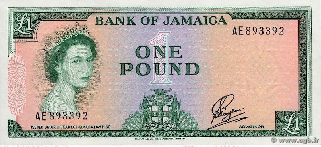 This £1 has the QEII engraving in green, along with most of the lettering & borders but a salmon pink under print. It like the other two "Latin Motto" notes are quite scarce in high grades. https://en.numista.com/catalogue/note218664.html1960 (1964) English-revised MottoP-51Aa,b,c,d FIVE Shillings:By the time TDLR revise the motto, Payton is still Governor & the serial # is just the same as P-49 for the a version. For the b version, the serial has a Times New Roman font. Version c has "Hall" as "Acting Governor" & d has the "Brown" signature as "Governor." https://en.numista.com/catalogue/note210304.htmlP-51Ba,b,c,d,e TEN Shillings:The revised 10/- has a similar issue with the Hall signature having 2 versions (c as "Acting Governor & d as "Governor") and the last e version has the Brown signature. https://en.numista.com/catalogue/note218665.htmlP-51Ca,b,c,d,e,s ONE Pound:The revised £1 has the exact same release as P-51B. There also exists a "SPECIMEN" version of this tough note. https://en.numista.com/catalogue/note218668.htmlP-52a,b,c,d FIVE Pounds:The highest £5 denomination was first released in 1967. The lower numbers meant another unique release. The a version has a Gothic serial # while the Roman numeral serial number (Payton) is used for the b version. Version c has Hall as "Governor" & d has Brown's signature. https://en.numista.com/catalogue/note218673.htmlAll of these notes are tough in high grades & all of their prices have soared. The above images are not notes in my possession (sadly, just screenshots) but I added them to demonstrate the dramatic change this issue underwent.
Edited by walk2dwater
01/06/2022 6:49 pm
|
|
Moderator
 United States
157664 Posts |
Very interesting. I hope some day you are able to acquire your own examples for your collection. Thank you for sharing the images, even if they are not your own, as they serve a broader purpose of this topic.  |
|
Pillar of the Community
Canada
2286 Posts |
Quote:
I hope some day you are able to acquire your own examples for your collection. I do too (though P-48 will likely be out of range). Quote:
Thank you for sharing the images, even if they are not your own, as they serve a broader purpose of this topic You're welcome & that's the way I look at: I thought it important to contrast the differences of the 2 series (the dimensions of the format & QEII portrait. It is always nice to see currency take on motifs of the nation's culture (or heritage) rather than simply reflect the pomp & pageantry of another (former) era. Typically we see the reverse sides with designs that reflect some of the local geography &/or industry.
|
|
Pillar of the Community
Canada
2286 Posts |
MALAYA & BRITISH BORNEO:These notes, like Malaya, Sarawak or Straits Settlements, are completely north of my budget. So once again, I'm left with posting an image of a note from another site. Like the BEP of the USA, these notes reached high $10,000 denominations. To get a better overview of this short, very difficult Board of Commissioners QEII series, check out the Bank Note Museum below: http://www.banknote.ws/COLLECTION/c...F%20CURRENCYAll of the QEII notes are issued on 21st of March 1953. P-1 ONE Dollar: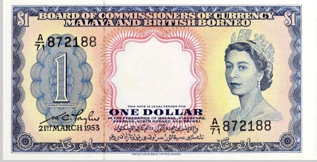 This bright orange & red note with blue frame has the queen on the right facing left. It has not too difficult to find these in circulated grades but much more challenging for the UNC examples. It was replaced 6 years later, in 1959, with a more generic, smaller sailboat design. https://en.numista.com/catalogue/note202268.htmlP-2 FIVE Dollars:This larger, green & yellow note, has similar design elements as P-1. It is very tough to find in high grades. https://en.numista.com/catalogue/note214919.html P-3a,b TEN Dollars:This red & yellow note has 2 colour variations, a red on green under print & b brown on yellow under print. The 2 versions look similar at first glance but on closer inspection, one sees definite differences (on the ONE counter to the left of QEII, for example). SCWPM never documented the 2 versions so it would be a good idea to be careful to note which if you manage to score one. https://en.numista.com/catalogue/note214920.htmlP-4a,b FIFTY DollarsThis larger dark, navy blue denomination also has dual colour variations. Block A/1 to A/09 have a blue-grey colour on the reverse while Block A/10 & up have just blue on back. https://en.numista.com/catalogue/note214921.htmlTh P-5 ONE HUNDRED DollarsThis Bradbury/Wilkinson high denomination is purple with yellow/pink under print. The note's design stands out. It also happens to be the last denomination that resembles the rest of the 1953 series. https://en.numista.com/catalogue/note214922.htmlP-6 ONE THOUSAND DollarsThis big purple on white note looks more like an old prized stock old stately national bond. It looks as big as a placemat & will cost a pretty penny. https://en.numista.com/catalogue/note214924.htmlP-7 TEN THOUSAND DollarsThis top green on white denomination is much like P-6. I'm sure that neither P-6 nor P-7 seen much circulation as they were more likely reserved for bank-to-bank transactions. https://en.numista.com/catalogue/note214927.html
|
|
Pillar of the Community
Canada
2286 Posts |
JERSEY(I apologize for misplacing this nation- should have been after Jamaica) Jersey is an inexpensive QEII UK territory to collect. It is much easier to acquire high graded examples from this island than the Isle of Man & the designs are very nice. Like all the island nations covered so far, the larger denominations can get pricey, but that is to be expected. Check out the Bank Note Museum for an overview of their denominations: http://www.banknote.ws/COLLECTION/c...972)%20Issue1963-1972 Issue:P-7 TEN Shillings:The 10 Bob from the States of Jersey is a small brown note which features the same QEII portrait used on the 1965 Eastern Caribbean States & St. Ouen's Manor on the reverse. It is not common but won't break the bank if you decide to acquire it. https://en.numista.com/catalogue/note209739.htmlP-8a,b,c ONE Pound: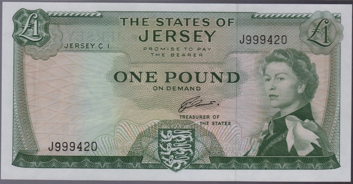 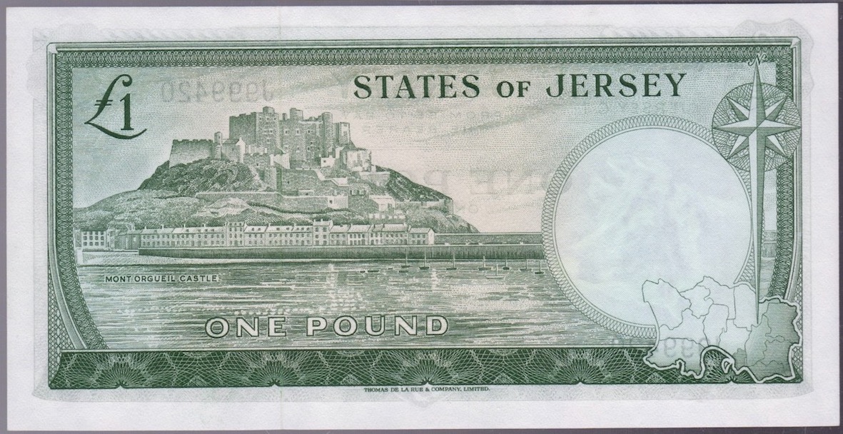 This green £1 feature Mont Orgueil Castle on the reverse. It had a Padgham " a" version, a Clennett " b" version & a variety with no signature " c" version (which I have never seen). The " b" version (pictured) is by far the most readily available & least expensive note in higher grades. https://en.numista.com/catalogue/note212780.htmlP-9a,b FIVE Pounds:The red & beige £5 features St. Aubin's fort on the reverse. It is a much tougher note than the lower denominations & becomes tougher in high grades (probably harder than P-10). https://en.numista.com/catalogue/note212781.htmlP-10 TEN Pounds:The larger purple & pink £10 features St Ouen's Manor on the reverse. It just has the second Clennett signature & can be acquired in high grades. https://en.numista.com/catalogue/note212782.html1976-1988 Issue:By 1976, the States of Jersey dropped the 10/- and added the £20 as the top paper denomination. P-11a,b,s ONE Pound: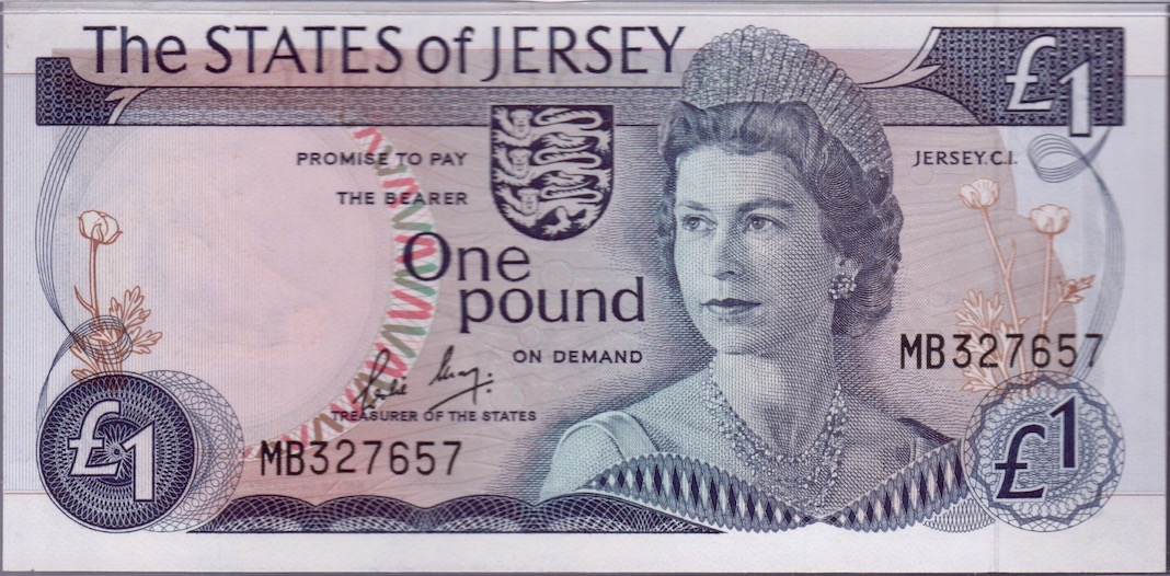  These redesigned £1 have two signature variations " a" for Clennett & " b" for Leslie May ( a tougher than b). I really dig the battle scene Coply painting on the reverse & neither version will break the bank. Be wary of specimens since these are often from broken sets of collector series. https://en.numista.com/catalogue/note205957.htmlP-12a,b,s FIVE Pounds:The tan brown £5 has a completely different colour scheme & Woolfe painting of Elizabeth Castle on the reverse. They have the same 2 signature variations (a&b) as P-11(above). They are surprisingly tough to find (in any grade) & can be costly. I would not buy the "specimen" collector's variety. https://en.numista.com/catalogue/note212784.html P-13a,ar,b,s TEN Pounds:The popular large green £10 features a painting of Victoria College on the reverse. Like P-12, it too has the 2 (a&b) signature varieties but "a" Clennett version also has a Z prefix replacement. https://en.numista.com/catalogue/note212785.htmlP-14a,b TWENTY Pounds:The largest rusty red brown £20 has the Jean Le Capelain portrait of Corey Castle on the reverse. The colour scheme is similar to the older P-9 £5 & later P-17 £10. It can be another tough one to find, but well worth the effort. A lot of QEII collectors also enjoy collecting the 'Leslie May' signature found in the next 1989 design revision with a more mature QEII ( P-15 to P-19). The £50 was introduced & the colour schemes finally gained some consistency. Personally, I have always favoured the older 1963 & 1976 series which I feel are all fairly attainable with the exception of some of the tough higher denominations.
|
|
Pillar of the Community
Canada
2286 Posts |
MALTAFrom 1949-1951, Villa Guardamangia in Pieta, Malta, served as the residence for Princess Elizabeth & Prince Phillip before Elizabeth ascended the thrown. This may be the reason we see early 1949 Maltese banknotes with the QEII portrait: https://en.wikipedia.org/wiki/Villa_GuardamangiaTo get a better grasp of the former " Government of Malta" issue vs the " Central Bank of Malta," it would help to view the Bank Note Museum: http://www.banknote.ws/COLLECTION/c...20II%20Issue1949 Government of Malta:Two denominations, the 10/- & £1 carry over the King George VI design elements with a small portrait of the princess. Both are printed by TDLR. P-23a,b TEN ShillingsThis lime green 10/- has two signature versions a for "Cuscheri" & version b for "Shepherd." Both are scarce but the b version is even more difficult to obtain in any grade. https://en.numista.com/catalogue/note213567.htmlP-24a,b ONE PoundThis rusty brown £1 has the same design elements as the KGVI issue with George's Cross on the left and the portrait of the princess on the right. The back looks similar to the GB reverse (shield). Just like P-23, this note has 2 signatures & each seem just as challenging. https://en.numista.com/catalogue/note233141.html1963 Government of Malta:In 1963, the government of Malta employ Bradbury Wilkinson to print a more elaborate banknotes. They use the popular portrait featured in the 1965 Eastern Caribbean series. P-25 TEN ShillingsThe George's cross is moved to the centre of the 10/- & we see more colours in the under print plus a primarily brown border on this green note. A harbour scene has been engraved for the reverse. Soler is the only signature. https://en.numista.com/catalogue/note233140.htmlP-26 ONE PoundThe £1 is identical to P-25 but still has the rusty brown colour & a larger format. Soler is the lone signature version & like all "Government" notes is tough to source. https://en.numista.com/catalogue/note233142.htmlP-27a,b FIVE PoundsThe navy blue £5 was introduced two years before P-25/26 so that it has the Shepherd (a) signature from the earlier series. Either it or the b (Soler) signature will be tough to acquire in better grades. https://en.numista.com/catalogue/note233143.html1967 Central Bank of Malta:In 1964, Great Britain grants Malta its independence. In the next few years, preparation must have been made for the formation of the Central Bank of Malta. P-28 TEN Shillings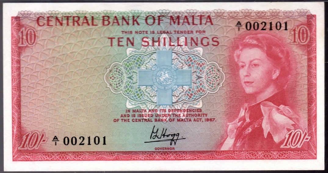 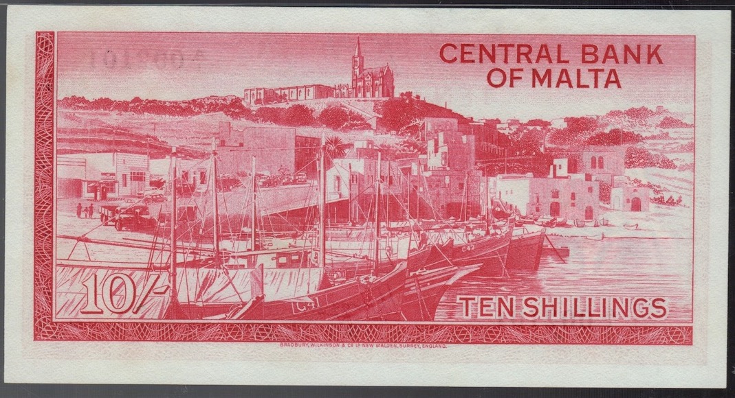 In 1968 a red 10/- appeared that had a design like P-25, but a different signature & a "CENTRAL BANK OF MALTA" title. It is much easier to source this note than the 2 earlier "Government" versions. https://en.numista.com/catalogue/note218160.htmlP-29 ONE Pound  This 1969 note has a greenish brown tinge to it so once again, other than the basic designs, many changes have occurred (compared to the "Government" version). It is also much easier to source but gets tougher in the higher grades. https://en.numista.com/catalogue/note204580.htmlP-30 FIVE PoundsThis "Central Bank of Malta" version of P-27 £5 has lost the blue colour of the earlier version & is more grey with some purples. Once again, this note is much more accessible than the blue P-27https://en.numista.com/catalogue/note233144.html
Edited by walk2dwater
01/09/2022 3:00 pm
|
|
Moderator
United States
157664 Posts |
Looking good! |
|
Pillar of the Community
Canada
2286 Posts |
MAURITIUSA tiny set of islands 1000km east of Madagascar, lies the nation of Mauritius. Like Malta, they start early with the "Government of Mauritius" & end with the "Bank of Mauritius" QEII 1967 series. They have a longstanding history of QEII notes & if you'd like to further see the various denominations, their designs, check out the Bank Note Museum: http://www.banknote.ws/COLLECTION/c.../MRS/MRS.htm1954 Government of MauritiusBradbury Wilkinson print this initial series featuring QEII on the right and a circular window (for the watermark) on the left. A different scene is featured on the 5, 10, 25 & 1000 Rupees (with each denomination increasing in size). P-27 FIVE RUPEESThere are 5 signature variations to this mainly blue 5 Rupees denomination. The first has Hinchey & Hurvais signatures, the 2nd has Wilson & Hurvais, the 3rd has "Bates & Hermans," the 4th has "Greig & Hermans," & the last combo was "O'Brien & Blackburn." All are equally tough in higher grades but the last signature is very scarce. https://en.numista.com/catalogue/note272075.htmlP-28 TEN RUPEESThis red & white 10 Rupees has 4 signature variations "Bates & Hermans" is missing. The first 2 are the same as P-27 but the last 2 signatures are "Greig & Blackburn" & "O'Brien & Blackburn." The last is just as scarce as we see for the 5 R. https://en.numista.com/catalogue/note272077.htmlP-29 TWENTY-FIVE RUPEESThe green 25 Rupees has 3 signature variations. The first 2 are the same as P-26/27 but the last is "O'Brien & Blackburn." It is likely the only time you'll see this signature if you're lucky enough to find an example. https://en.numista.com/catalogue/note272079.htmlP-29A ONE THOUSAND RUPEESThe purple 1000 R is pretty scarce as that was a lot of money back in the day. Few people could afford to keep one as a souvenir. Anyway, to see one, check out the Numista link: https://en.numista.com/catalogue/note272080.html1967 QEII Bank of MauritiusThomas De La Rue (TDLR) took over producing banknotes in 1967 & created a nice set of notes with a similar colour scheme but added colours & more complicated designs. The reverse engravings all reflect scenes typical of the rich floral & fauna of Mauritius. P-30a,b,c FIVE RUPEES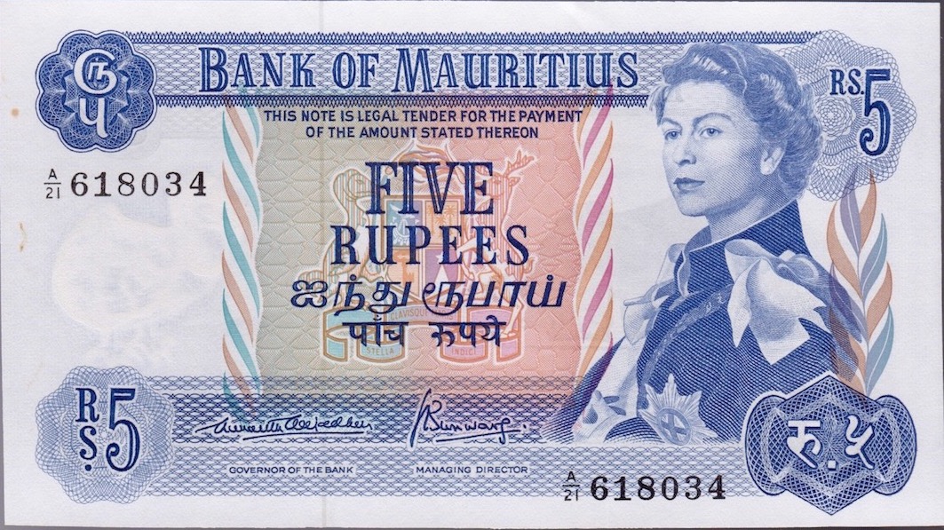 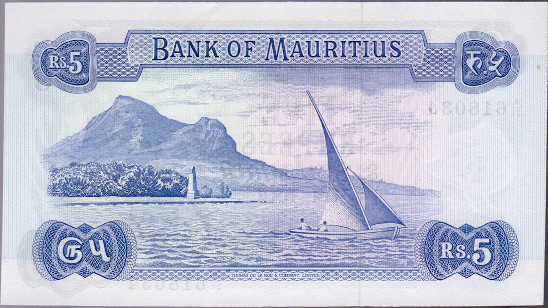 Finally, the SCWPM take note of the various signature varieties with the b version (pictured) being the toughest of the 3. The last signature c is by far the most common & these outnumber both a & b combined. There are also tough ' Z' prefix replacements for a & c. This attractive blue 5 Rupee has a sailboat on the reverse. https://en.numista.com/catalogue/note215381.htmlP-31a,b,c TEN RUPEESThis red & white denomination is exactly like P-30 when it comes to tough varieties (look for either a or b). It is easily attainable in top grades (compared to the "Government" series). https://en.numista.com/catalogue/note210002.htmlP-32a,b TWENTY-FIVE RUPEESThis green & white mid-denomination has only 2 signature variations with the early a version being only slightly more elusive than the b version. A farmer driving an ox & cart with plantations & mountains in the background can be seen on the reverse. Once again, the 25 Rupees isn't too tough to find in high grades. https://en.numista.com/catalogue/note239296.htmlP-33 FIFTY RUPEESThis largest purple 50 Rupees replaced the 1000 R from the previous "Government" series. It is like P-30/31 in that it has 3 signature variations but the first ( a) happens to be the scarcest variety with a mere 500,000 issued. https://en.numista.com/catalogue/note201779.html
Edited by walk2dwater
01/10/2022 12:56 pm
|
|
Moderator
United States
157664 Posts |
Very nice! |
|
Pillar of the Community
Canada
2286 Posts |
New ZealandWe know we're just about completed all the QEII nations when we come to New Zealand. There's just 6 more countries (if we count the various Rhodesia versions as 1). New Zealand is a small country but not as small as GB'd territories, the recent 'M' countries & most Caribbean islands. Collecting the early notes with QEII portraits is much like collecting Canadian banknotes ( very accessible/doable for the lower denominations much tougher as the denominations get higher). The nation's conversion to the dollar didn't occur till 2 years after the Caribbean nations (Bahamas, ECS) & 1 year after Australia, in 1967. Check out the Bank Note Museum for an overview: http://www.banknote.ws/COLLECTION/c...llar%20Issue1967-1981 QEII Dollar Issue:The young portrait of QEII is on the front right & each denomination features a bird native to the country. The ONE & TWO are basically brown & white with a splash of under print for the TWO. The notes get much more colourful (& larger) as the denomination increases (but they also get very tough to acquire in higher grades). P-163a,b,c,d ONE Dollar: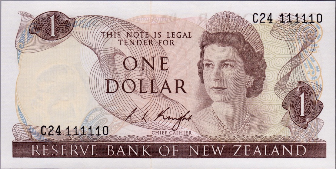 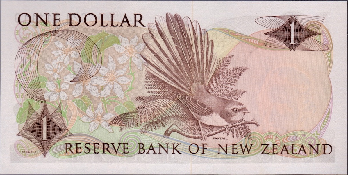 The first a version of this lowest denomination appears with the " Flemming" signature & is the toughest of them all (issued for 1 year & with limited prefixes). The b version with the "Wilks" lasted 7 years, while c(Knight) went for 3 & the last d (most common), with "Hardie" went for 4 years. There are replacements with the Knight & Hardie signatures. https://en.numista.com/catalogue/note202557.htmlP-164a,b,c,d TWO Dollars:The slightly larger $2 has a similar roll out as P-163 but with LESS # issued & as a "workhorse" can be tough to source (especially the first short-lived a signature variety). It also has 2 replacements found with the last 2 signature variations ( c & d). https://en.numista.com/catalogue/note202549.htmlP-165a,b,c,d FIVE Dollars:This larger, orange-red $5 gets tougher still to acquire in higher grades & the a "Flemming" variety will cost you the most. It had 2 asterisk replacement prefixes released for the c Knight signature & this note can be expensive. https://en.numista.com/catalogue/note202550.htmlP-166a,b,c,d TEN Dollars:The $10 has black borders & light blue, elaborate under print (to set it off from P-163 & P-164). It also features the mountain lily & Kea bird on the reverse. All 4 versions can be tough but the a (Flemming) variety & the b (Wilks) asterisk replacement will be the toughest. https://en.numista.com/catalogue/note202496.htmlP-167a,b,c,d TWENTY Dollars:The green-tinged $20 is a tough note to find in high grade. No replacements were issued but the a (Flemming) version will be elusive enough. https://en.numista.com/catalogue/note210519.htmlP-168a,b ONE HUNDRED Dollars:This dark red $100 only had the two: the "Flemming" a variety & the "Knight" b type. Both versions can be tough to source & expensive to acquire in higher grades. https://en.numista.com/catalogue/note210548.html 1981-1992 QEII Issue:The young QEII portrait is replaced by a more mature version in this series which adds a $50 note with a Morepork Owl onthe reverse. The designs (& colour schemes) are essentially the same as the 1st version except that the $10 appears slightly more purple with emphasized green under prints. P-169a,b,c ONE Dollar:This note comes in 3 signature variations. The first a version employs the "Hardie" signature from the first issue. The b version is "Russell" & the c version is "Brash." All three are fairly easy to come by with the exception of the Hardie replacement. https://en.numista.com/catalogue/note206303.html P-170a,b,c TWO Dollars: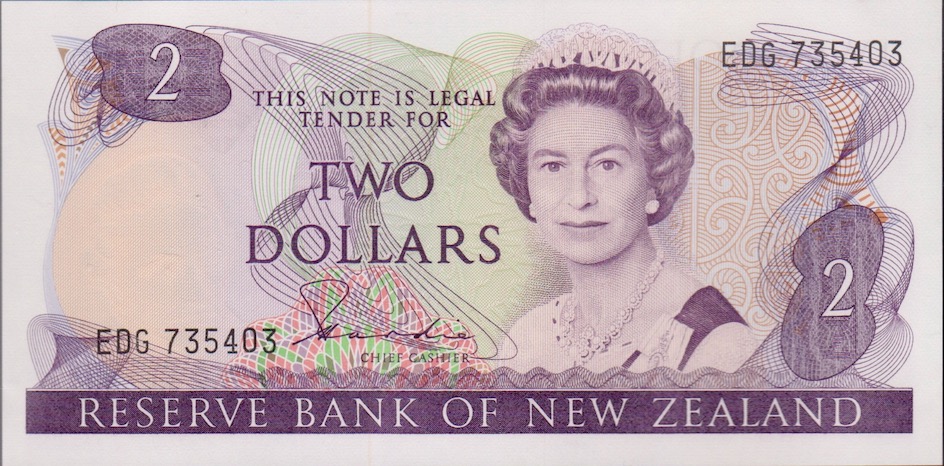 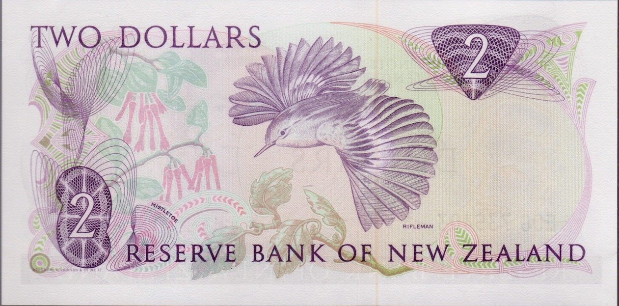 As you can see this $2 https://en.numista.com/catalogue/note206303.htmlP-171a,b,c FIVE Dollars: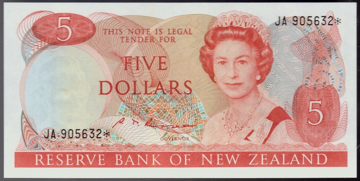  The $5 is fairly easy to acquire. Above is an example of the b Russell replacement. https://en.numista.com/catalogue/note205603.htmlP-172a,b,c TEN Dollars:The $10 may be a bit tougher than the lower denominations. https://en.numista.com/catalogue/note205605.htmlP-173 TWENTYa,b,c Dollars:The $20 can be a bit tougher (especially the "Hardie" a version) https://en.numista.com/catalogue/note210522.htmlP-174a,b FIFTY Dollars:This orange-red $50 can be tough to find in higher grades. Only the Hardie & Brash signatures were released. https://en.numista.com/catalogue/note210536.htmlP-175a,b ONE HUNDRED Dollars:This dark red $100 can be tough for the 2 a & b versions. Only the Hardie & Russell signatures were released. https://en.numista.com/catalogue/note210549.html
|
|
Moderator
United States
157664 Posts |
Lovely examples! I have always liked the NZ designs. |
|
Pillar of the Community
Canada
2286 Posts |
Quote:
Lovely examples! I have always liked the NZ designs! -Thanks! & Yes, their designs are very progressive, yet capture the natural beauty of the country. The 1990 Commemorative $10 & the 1992-1999 issue is very popular too. This $5 P-177 acknowledges Sir Edmund Hillary:  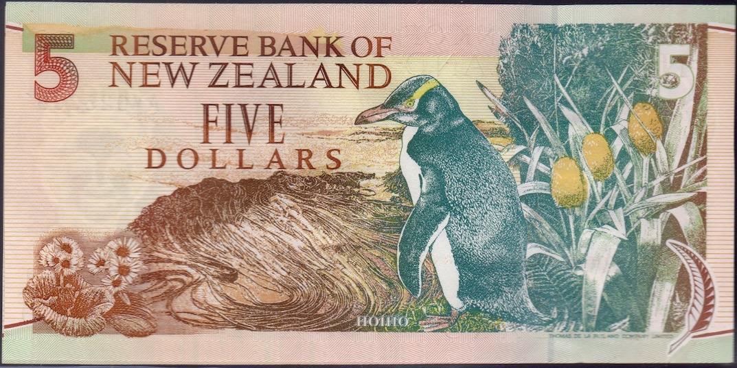 The $20 P-179 continues to acknowledge QEII with a mature portrait keeping with the times: 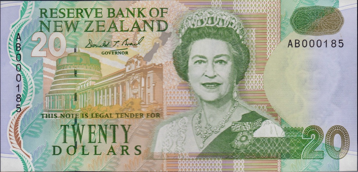 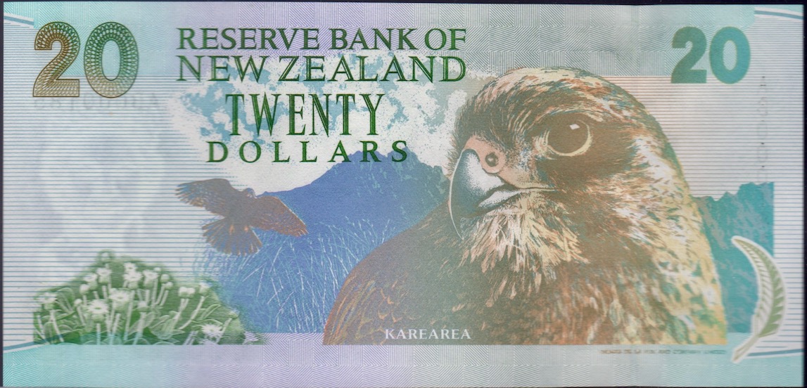 and the image of Karearea in front of the mountains is very dramatic.
|
|
Pillar of the Community
Canada
2286 Posts |
SOUTHERN RHODESIAI will look at Southern Rhodesia first, then Rhodesia & Nyasaland & Rhodesia last. This follows the timeline that the nation changed its names. Unfortunately, most of what I document here will be from basic observations gleaned from the various online databases. I have no notes from the first 2 colonies. To get a better understanding of the denominations, signatures & variations it would serve you well to check out the Bank note Museumhttp://www.banknote.ws/COLLECTION/c.../ZIM-SRH.htm1952-1953 Southern Rhodesia Currency Board issue: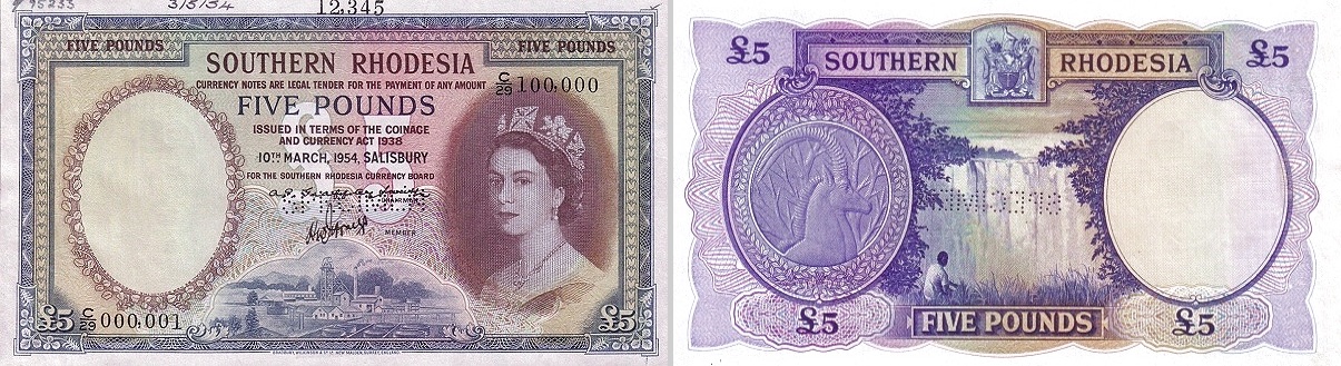 It is a very subtle line which is immediately below the date which distinguishes this brief "Southern Rhodesia" issue from the "Central Africa" currency boards. I've included an image I copied from the Bank Note Museum of the £5 specimen since the regular issue are so scarce, no collector has volunteered an image. P-12a,b TEN ShillingsThe orange-brown 10/- features a young QEII on the right & a rectangular panel on the left (for watermark & SN). Two signature variations exist ( a & b) with both being equally tough to source. Each variation issued was dated only one month apart. https://en.numista.com/catalogue/note248214.htmlP-13a,b,c ONE PoundThis greenish-yellow £1 features a young portrait of QEII on the right & a circular panel on the left. An image of The Great Zimbabwe ruins has been engraved on the reverse. There are three variation for this denomination. https://en.numista.com/catalogue/note248215.html P-14a,b FIVE PoundsThe mauve & various hues of red & brown create a dramatic looking £5 note (as pictured above in specimen form). The existence of P-14b remains doubtful. The reverse image features Victoria Falls. https://en.numista.com/catalogue/note248218.htmlP-15a,b TEN PoundsThe yellow-brown £10 has similar design features as its lower denominations. However, the reverse is more green in hue & features a herd of elephants. They will be expensive in any condition. https://en.numista.com/catalogue/note248219.html1955 CENTRAL AFRICA Currency Board issue:The SCWPM distinguished this variation from the original simply due to the CENTRAL AFRICA reference (under the date). Other than that, the 2 versions are identical. P-16 TEN Shillings:This rusty brown 10/- looks exactly like P-12 save the 1955 date & the CENTRAL AFRICA Currency Board under the date. https://en.numista.com/catalogue/note248220.htmlP-17 ONE Pound: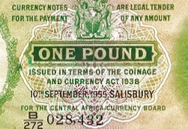 The above image shows the " FOR THE CENTRAL AFRICA CURRENCY BOARD' line added to these last version of notes issued for Southern Rhodesia. The £1 has 3 different "MEMBER" signatures but SCWPM never acknowledged these different variations. It is likely that all 3 versions have been equally scarce to acquire so this point is probably moot. https://en.numista.com/catalogue/note248221.htmlP-18a,b FIVE Pounds:The £5 looks just like the specimen image above save for the date & CENTRAL AFRICA reference noted for P-17 & P-18. The Bank Note Museum has images for the regular issued notes, with both a & b signature variations. It can be deduced then, that the 1955 Central Africa series is probably a little easier to acquire than its former "Southern Rhodesia" version. https://en.numista.com/catalogue/note248223.html
Edited by walk2dwater
01/12/2022 3:49 pm
|
|
Pillar of the Community
Canada
2286 Posts |
RHODESIA & NYASALANDAccording to wiki, "Between 1953 and 1963, Southern Rhodesia was joined with Northern Rhodesia and Nyasaland in the Federation of Rhodesia and Nyasaland." The new country only lasted briefly & issued currency for 5 years. Oddly enough, these were dated every single time they were issued so there could be 20-30 issues per year (like in 1960). https://en.wikipedia.org/wiki/Rhodesia1956-1961 Bank of Rhodesia & NyasalandP-20 TEN Shillings:This note looks similar to the Southern Rhodesia's P-12 & P-16 except the front is less segmented (no panels) & the reverse- replaces a Victoria waterfall scene for a panoramic landscape. The 10/- markers are in the corners & there is an image of an eagle landing to the left. One signature (Governor) replaces "Member" & "Chairman." https://en.numista.com/catalogue/note304098.htmlP-21 ONE Pound:This greenish £1 looks almost identical to Southern Rhodesia's P-13 & P-17 except for the "Bank of Rhodesia & Nyasaland" title, pinkish orange under print & an image of a leopard below the right oval window. The reverse image of the Great Zimbabwe Ruins remains the same. https://en.numista.com/catalogue/note201810.htmlP-22 FIVE Pounds:This blue £5 looks very similar to Southern Rhodesia's P-14 & P-18 except for the "Bank of Rhodesia & Nyasaland" title, a lighter greenish-blue under print & an image of a sable antelope below the right oval window. The reverse image of Victoria Falls has been radically redesigned. The new version embeds the scene over the entire note while the older P-18 version wedged the falls scene between 2 oval windows. Overall, the note's design is much less segmented than the Southern Rhodesia £5 rarity. https://en.numista.com/catalogue/note233439.htmlP-23 TEN Pounds:This £10 is far more similar to Southern Rhodesia's P-16 except for the "Bank of Rhodesia & Nyasaland" title. These notes have such similar designs that I had to reexamine their images several times before I could spot a few differences (besides the title). The biggest difference is the image of the lion & the tree behind it. Bradbury Wilkinson's first design shows mostly the face (head) while their 2nd version includes the body & the lion looks to the left slightly. The reverse image of elephant herd appears to be identical. https://en.numista.com/catalogue/note280541.htmlAll of the 4 denominations have either Governor Graffety-Smith ( a) or Governor Richards ( b) signatures. I don't believe that owning 1 over the other makes much difference except for the £10 which appears to have had a very short run of the b (Richards) signature.
Edited by walk2dwater
01/14/2022 09:55 am
|
|
Moderator
United States
157664 Posts |
Very interesting! Of course, I had to go reacquaint myself with the history of that region. |
| |
Replies: 189 / Views: 15,707 |
To participate in the forum you must log in or register.
 
- 1917 In Good, Fair Or Poor Condition?
- Post Your Coins, Medals And Tokens Featuring Ground Transportation
- 20 Questions! (Forum Game) 11/04/24
- Fun Thread - Worst Coins On Ebay, Etsy, Craigslist, And Other Buying Sites!
- Post Your Coins Representing The Animal Kingdom.
- Post Your Bird Coins
- BU Modern Coins And Many Silver Classics; Wheats, Barbers, Indian Cents, & More!
- Continuing List To Show Everyones Latest Acquisitions
- Post Your Tiny Coins!
- Queen Elizabeth II Memorial Thread
- Collegebarber's Trade List: Modern US Coins, Canadian Cents, Paper Money, And More!
- Around The World With Coins - A Coin Geography Game
- 100 Coins From 100 Different Countries In 100 Different Years (19th Century Edition)
- Colonial 1724 Hibernia Half Penny NGC VF30
- Have You Been Having An Issue Logging In?
- Starting Down Another Rabbit Hole - Arkansas Notes And Scrip
- How Far Back Can We Go? Eighth Edition!
- 1872 Seated Dollar PCGS PR64CAM With And Without A CAC Sticker
- Discover Scripotime - A New Hub For Scripophily Collectors! (Financial Certificates Collecting)
- 1962 Lincoln Memorial Proof Penny?
Disclaimer: While a tremendous amount of effort goes into ensuring the accuracy of the information contained in this site, Coin Community assumes no liability for errors. Copyright 2005 - 2025 Coin Community Family- all rights reserved worldwide. Use of any images or content on this website without prior written permission of Coin Community or the original lender is strictly prohibited.
Contact Us | Advertise Here | Privacy Policy / Terms of Use
|
| Coin Community Forum |
© 2005 - 2025 Coin Community Forums |
| It took 0.67 seconds to rattle this change. |
 |
|
| |
| |


